
Pacemaps
Overview
A concept for a social sharing maps that allows users to create and share beautiful, customizable route maps from their activities.

Activity tracking apps don't have maps that users want to casually share on social media
The Challenge
Current activity tracking apps often present route maps in a cluttered, data-heavy format that isn't suitable for social sharing. Users need a way to create visually appealing maps that highlight their achievements without exposing potentially sensitive performance metrics.
Imagine training for an event with your blood, sweat, tears—pushing yourself to your edge…

and you open up your tracking app to this hoopla. Not to mention it contains metrics that you might not be proud of.
Another scenario would be Pacemaps. Where you can quickly access logged routes and share your maps with friends.

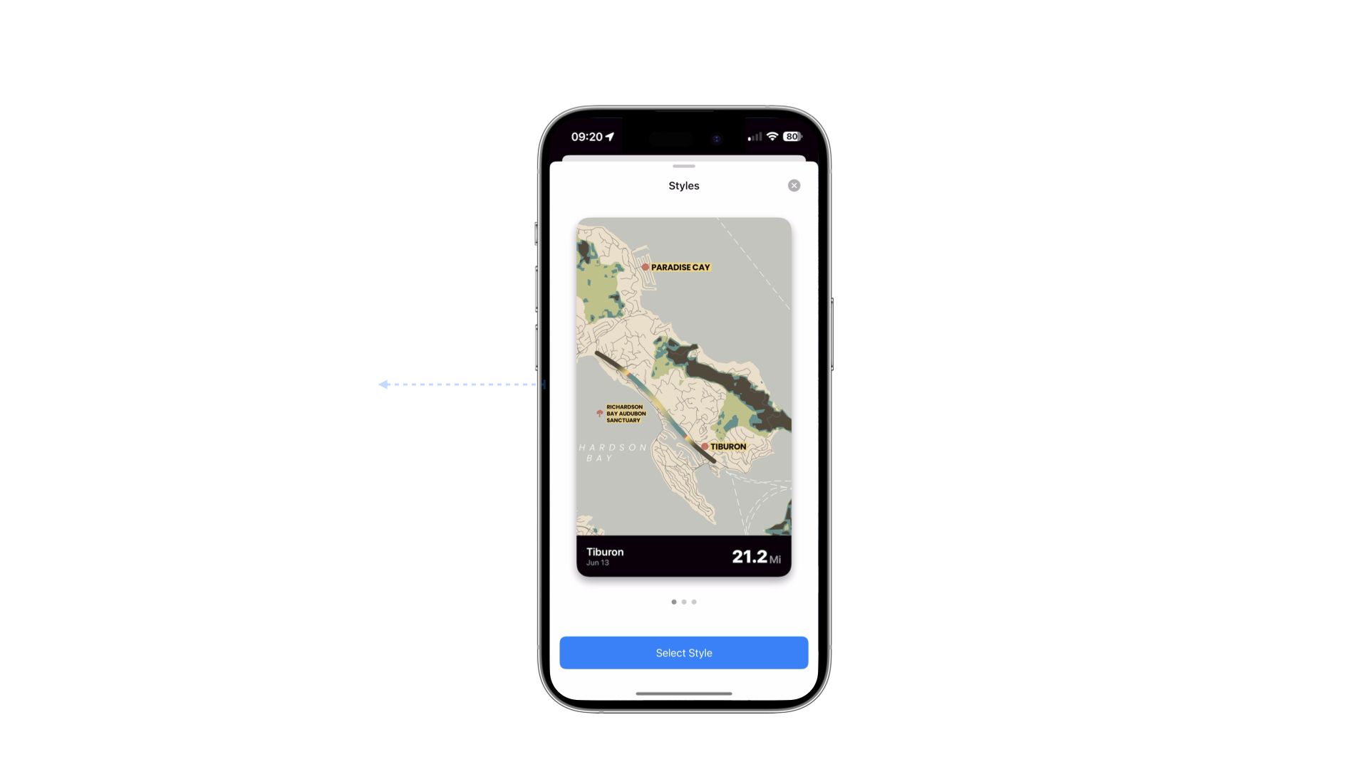
Activity -> Routes Logged -> Map Style Selected -> Format Selected -> Image Shared
The Process
Starting with a weekend prototype, I explored technical feasibility, user flows, and visual design iterations to create an intuitive and beautiful map sharing experience.

I spent a weekend on this so really time was the only constraint other than to know if it were technically feasible or not.

To prove the technical feasibility, I created a simple NextJS app to see if I was able to convert the common file format of GPX to GeoJSON to map.

There were two main approaches that I could take. The first would require a shared link to a server to dynamically present the appropriate image size using dynamic OpenGraph images. The second does not require a server and a user could simply share a link.

After identifying the implementation constraints I began to wireframe in Figma

Adding the ability to select the aspect ratio would increase the ease of sharing

I considered an image preview

However, the image preview proved to be unnecessary. So I began iterating on the visual design by starting with the metrics view first.

Diving deeper into the visual design and branding I began to iterate on the core element.

I previewed how these emerging visual patterns looked in contrasting background colors.

Once I found a metric style that I liked, I stress tested the design with mockup data. This highlighted several issues with scalability and prominence of information that wasn't relevant.

Here I again narrowed on a design that reflected the information that is important to users while de-emphasizing elements of less importance—establishing a clear visual hierarchy.

I continued to modify the previous selection until the screen data density felt appropriate.

Swapping the text and the metric created a more clear and scanable screen.

Adding it to the wireframes, a visual language starts to emerge.

I continued to add elements across the other screens including wireframe explores of stylized maps.

I took a regrettable side quest using Claude to build a drop shadow customizer. That would output CSS and SwiftUI styles of intricate drop shadows. There's no greater feeling than nailing a drop shadow but this was a waste of time.
The Solution
A streamlined iOS app that transforms activity routes into beautiful, shareable maps with customizable styles and aspect ratios, focusing on visual appeal while maintaining data privacy.

I began building the screens in DetailsPro which is a visual design tool that outputs SwiftUI. Screen 1: Figma. Screen 2: DetailsPro.

Cursor is my IDE of choice.

I use Cursor to roughly implement the screens and interactions.
Xcode is used to connect views and preview the implementation.
Results
Through iterative refinement, we achieved a natural, intuitive interaction model that enhances the user experience while maintaining the app's clean, focused design.
As the product began to come together I felt that that the swiping interaction was too rigid, being locked to the X axis.
Using Cursor I refined the motion to follow the natural gesture of the thumb.
Right, as left, feels more natural on an arch.
Lessons Learned
The Pacemaps project reinforced the importance of focusing on core user needs and maintaining simplicity in design, while also highlighting the value of early technical validation and iterative refinement.
The Pacemaps project taught me several valuable lessons about rapid prototyping and user experience design:
- Sometimes the simplest solution is the best one - removing the image preview simplified the user flow
- Visual hierarchy is crucial for data-heavy interfaces
- Natural gestures and interactions can significantly improve user experience
- Technical feasibility should be validated early in the design process
- Focus on core functionality before adding polish - the drop shadow customizer was a fun but unnecessary detour
Note: Some visuals and product details have been omitted or altered due to confidentiality.
Explore More Work

